New Connections App
Bridging human connections
As a versatile Product Designer, my team and I supported a fellow founder’s unique social media take that facilitated face-to-face communications through a common-interest app that we launched on iOS and Android.
Problem Statement
There is a pressing need to make physical connections as people are wrapped up by avatars and anonymity on the internet. With isolation and depression on the rise, there is a need for platforms that emphasize social interactivity.
Team Composition
1 Product Owner
1 Product Designer
2 Full-Stack Software Engineers
My Impact
Implemented feedback from usability studies
Iterated on design work for client satisfaction
Worked on front-end implementation of styles
A New Kind of Social Media
Creating genuine connections, while prioritizing safety, was a challenge that our client was trying to alleviate before and throughout the pandemic. His idea was to build an innovative social media app, for iOS and Android, that was designed for college students to make new connections.
Advocacy & Representation
I acted as the sole spokesperson for design and helped guide decisions and act as a sounding board regarding the app's strategic features relative to university students.
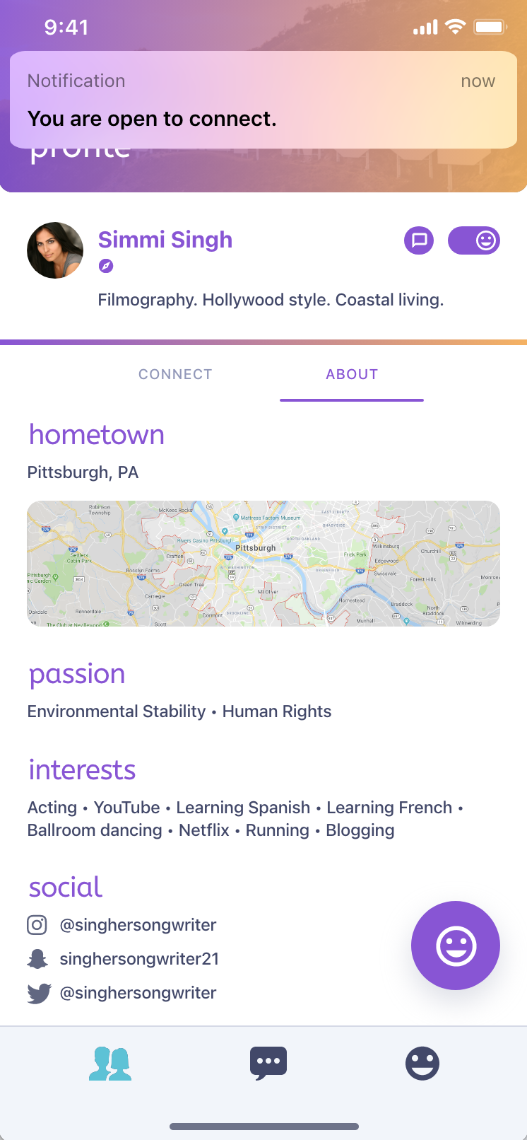
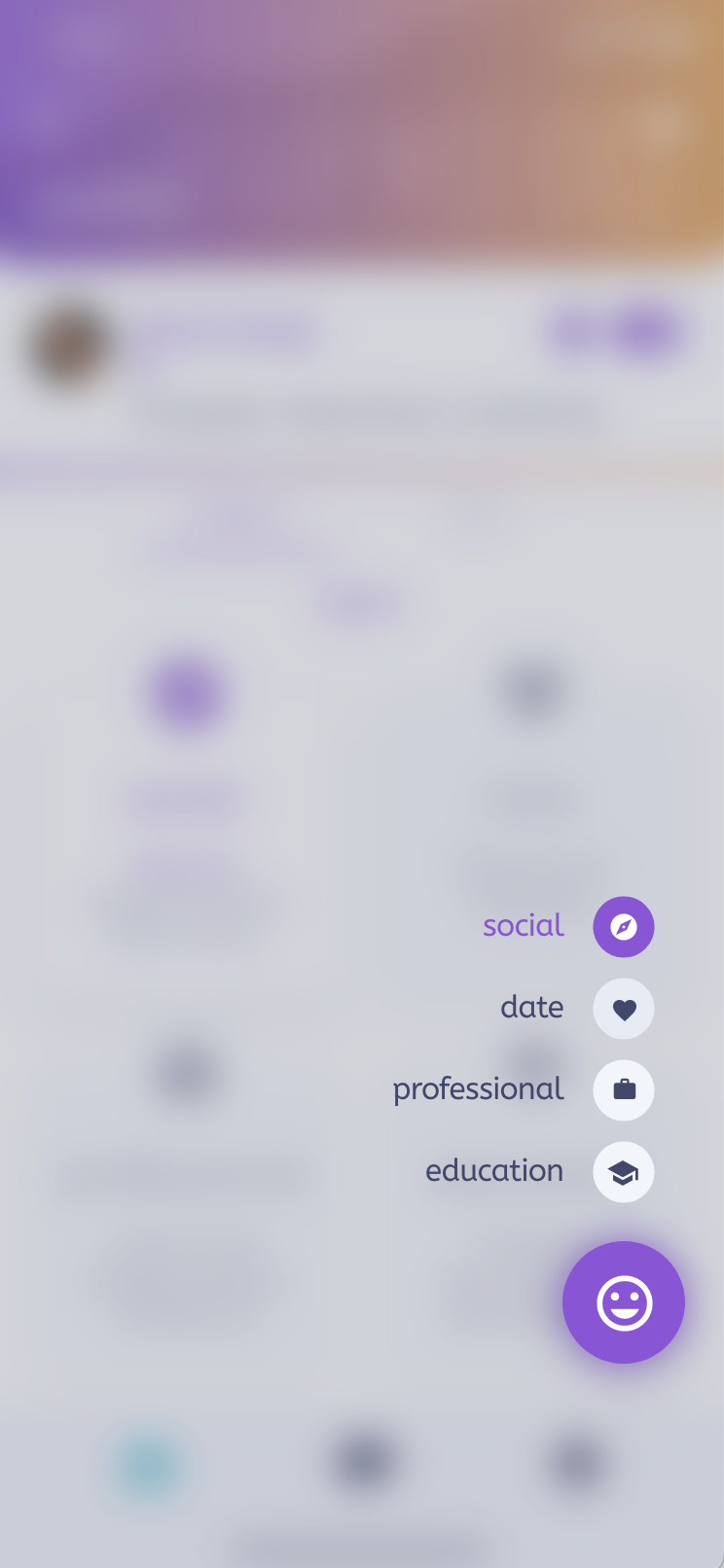
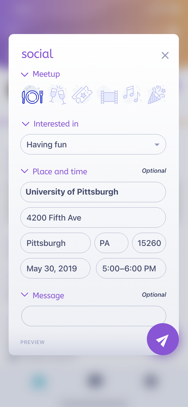
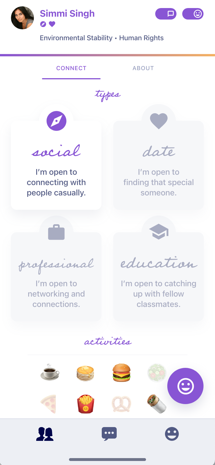
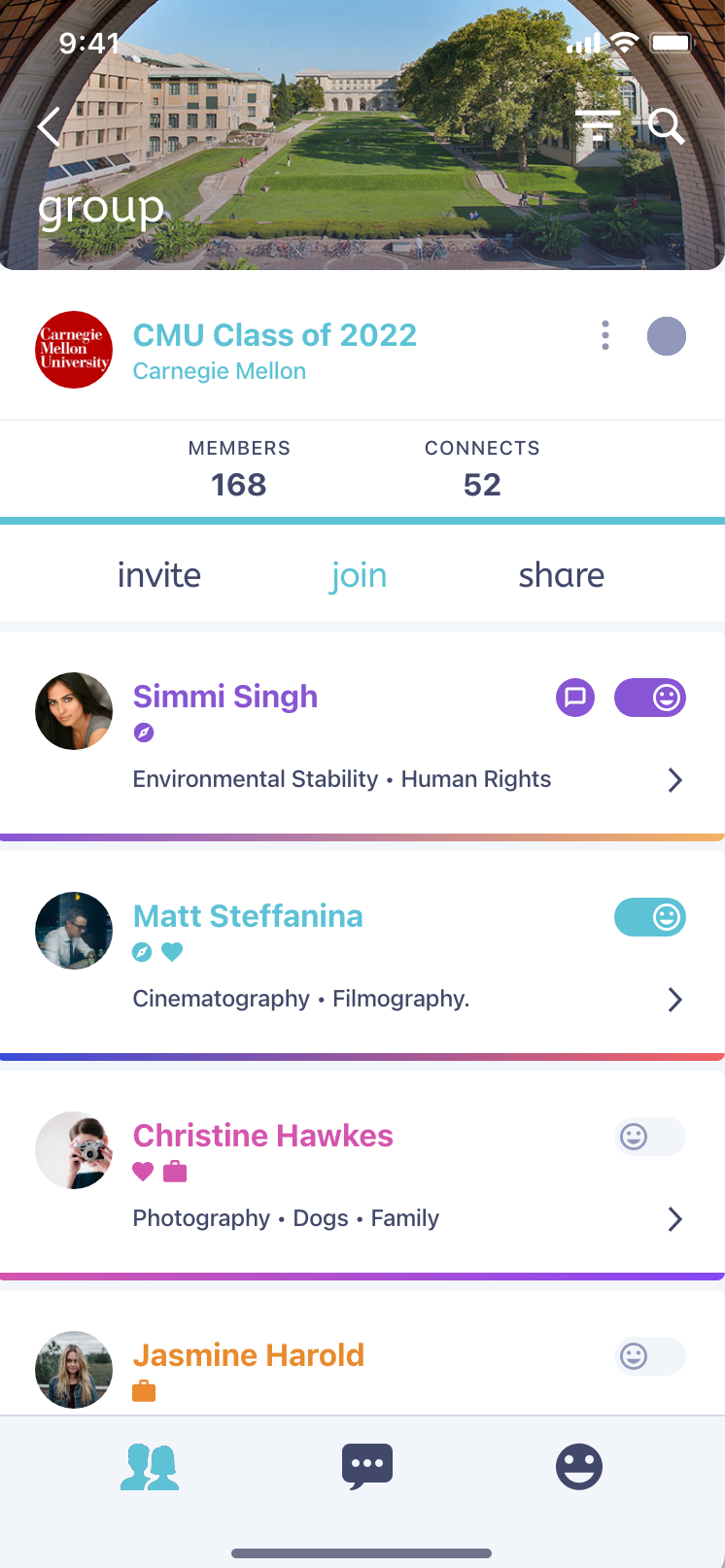
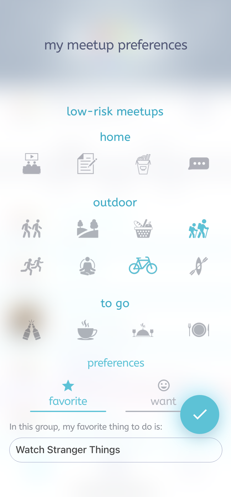
Students could express their social preferences and choose activities that resonated with their personalities. Whether they were looking for a study buddy, new friend, professional connection, or date they could make that selection in-app. The inclusion of specific group affiliations like University, Company, or City further fine-tunes the connection process, ensuring users find like-minded individuals within familiar contexts.
Hands-On Product Roadmap
The primary audience of the app was intended to be college students—a demographic greatly impacted by social restrictions during the pandemic. During that time, specifically, the ability to see other people was greatly diminished; if you did happen to venture out with a mask on, conversations were usually brief. Could this app be used to make connections happen, even during lockdown? Our goal was to build the app and find out from students.
Research and Innovation
It was useful to have a Founder who had strong ties to a University group which he could garner insights from; we utilized their feedback to provide a better product experience.
During the project, the client had access to a cohort of students at his alma mater that he could talk to about the app; he wanted to see if there was viability in facilitating social connections via interests, passions, and location. From his research, it seemed that students would use this app if they could message people, suss them out ahead of time, and pick what activities they could do.
By relaying the data, we gained insights into the efficacy of features and potential barriers. We were able to tailor the app's interactions to resonate with its users by building the requested features. This led to a product roadmap, where new features were being incubated while the app was being designed; however, this approach did lead to a few iterations.
Crafting the Design System
The heart of an app’s visual identity is its branding and design system. A comprehensive design system will align with the branding choices from various perspectives, as shown below. I kept the color palette airy through gradients and vibrant colors and used the fonts that the client wanted. By incorporating the following elements, I ensured that the components adhered to the brand guidelines:
Typography: A harmonious blend of fonts to enhance readability and evoke a friendly tone.
Iconography: Distinctive symbols and icons that convey functions and themes effortlessly.
Palette: A mix of vibrant tones, striking the balance between enthusiasm and trust.
Visual Design: A comprehensive design outlook that fuses these elements.
Lesson Learned
Before designing features in a hi-fi environment, it's imperative to implement an incremental approach to create an Agile feedback loop for experimentation. Design is usually less expensive than development, but constant pivoting in hi-fi can lead to costly redesigns.
Detailed specs, including spacing from padding and margins, font families and their links, color hex codes, and component states are incredibly useful when moving from design into development. As a multidisciplinary designer who has experience in building front-ends from the designs I have created, knowing what developers need is an insightful and useful skill.
College Student-Based Interactions
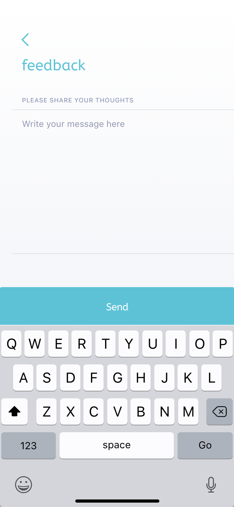
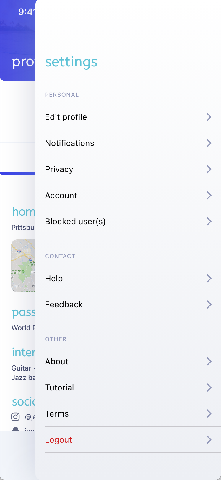
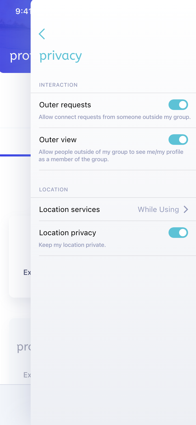
Having a Design System in place, it was time to move into creating the interface that would become the front-end experience for college students to create meaningful connections. Relative to the issues above, there were a couple of different paths taken in terms of requested features, branding, and messaging. Ironing those out, I designed many cornerstone pages of the app across signup, group creation, profiles, messaging, and preferences.
Lesson Learned
The number of screens doesn't matter, it's all about the outcomes. User experience research would favor hypothesis testing to prove our assumptions were correct, or need adjustments.
Some of the features that were introduced had complex flows behind them or different states to consider, so it was important to align with the needs of the users and build to what made sense to them. I took components that leveraged Atomic Design, and components from Apple’s iOS library to build pages, modals, and cards. We ended up with 40+ pages that represented the app from different viewpoints and interaction patterns.
A Smooth Handoff to Development
Stakeholder Collaboration
There was close cross-functional collaboration that ocurred throughout this project, as Engineering was concerned with the scope of features that were requested by the Founder; I helped pare down requests into a feasible roadmap.
After the design was complete and signed off on, we were ready to move into development. I was there to ensure a smooth transition to the development phase. Providing detailed specs could ensure our team could replicate the design vision with accuracy. Nowadays, using Figma’s DevMode makes things a bit easier to provide detailed specs without much of a hassle; in using Adobe XD, I provided the Spec link, comments, and documentation needed to move forward.
With a small team, we all wore various hats; I worked with my team to develop the front end of the app, while they created the API endpoints and spun up a cloud-based backend in AWS. This was one of my first forays into the world of mobile development, working on React Native components and styles was interesting, and I’ve always liked to see how one can work with data in the context of web and mobile apps to create dynamic interfaces. I got to see how the team created seeded databases, hooked up endpoints, and introduced libraries for additional functionality, such as messaging.
A Culmination of Cross-Disciplinary Efforts
After a few months of developing, testing, and refining, the app was finally ready to be launched on the corresponding App Stores for iOS and Android. Working in React Native allowed us to launch on both platforms simultaneously, not without some headaches from implementing native services. The app was a culmination of collaborative efforts, intuitive design, and full-stack development, leading to an app that could help students foster genuine connections even in challenging times.
Outcomes and Results
I designed the entirety of an app's end-to-end experience that helps students connect, even during the pandemic. With a propensity for designing and developing intuitive interfaces, I helped deliver a seamless app that the client and his users enjoyed using.
Disclaimer: Work shown was created while employed at Nearby Creative and displayed with permission. Header image from Unsplash.


