AP Course Companion App
Enhancing testing abilities
As the sole Product Designer of a startup specializing in Software Engineering, I had the opportunity to work on the end-to-end experience, branding, and launch of an AP US History mobile app across iOS and Android.
Problem Statement
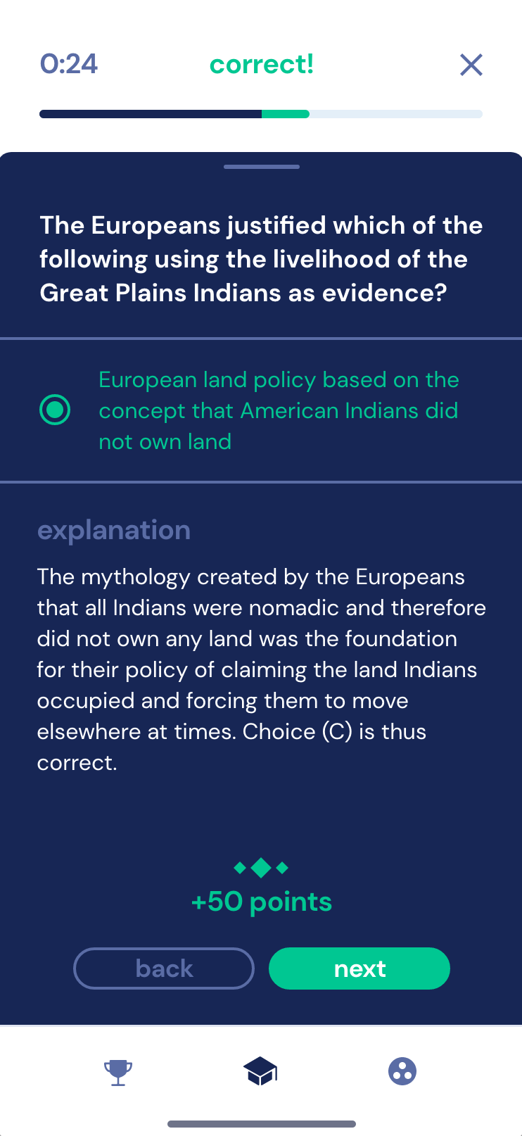
AP courses can be overwhelming for students due to the added stress of college admissions and a high-stakes environment for scoring well; how can we make them engaging and entertaining without diluting the academic content?
TEAM COMPOSITION
1 Owner/Client
1 Product Designer
2 Full-Stack Software Engineers
1 Technical Writer
My Impact
Leveraged feedback to create seamless interactions
Worked with client on business strategy and gamification
Designed custom, branded components and assets
Helped students pass AP classes with study companion app
Helping Studious Students Succeed
In high school, students take AP courses to help them understand complex subjects and potentially earn college credit before graduation. During our initial meetings, it was evident that we could help bridge the gap between technology and testing. The teacher/client, known for his exceptional track record in guiding students through the AP US History (APUSH) exams, felt the need to digitalize and optimize the learning process. His vision was for a versatile tool that could cater not only to APUSH but eventually to other AP course subjects and even college courses.
Starting with APUSH for our MVP allowed us to craft a tailored, quiz-based that could serve as a prototype for future expansions. This endeavor required a diverse skill set; assembling a dedicated team for the project became crucial. Each member played a significant role in shaping the app’s direction and eventual launch on the corresponding app stores for iOS and Android.
The Gamification of Learning
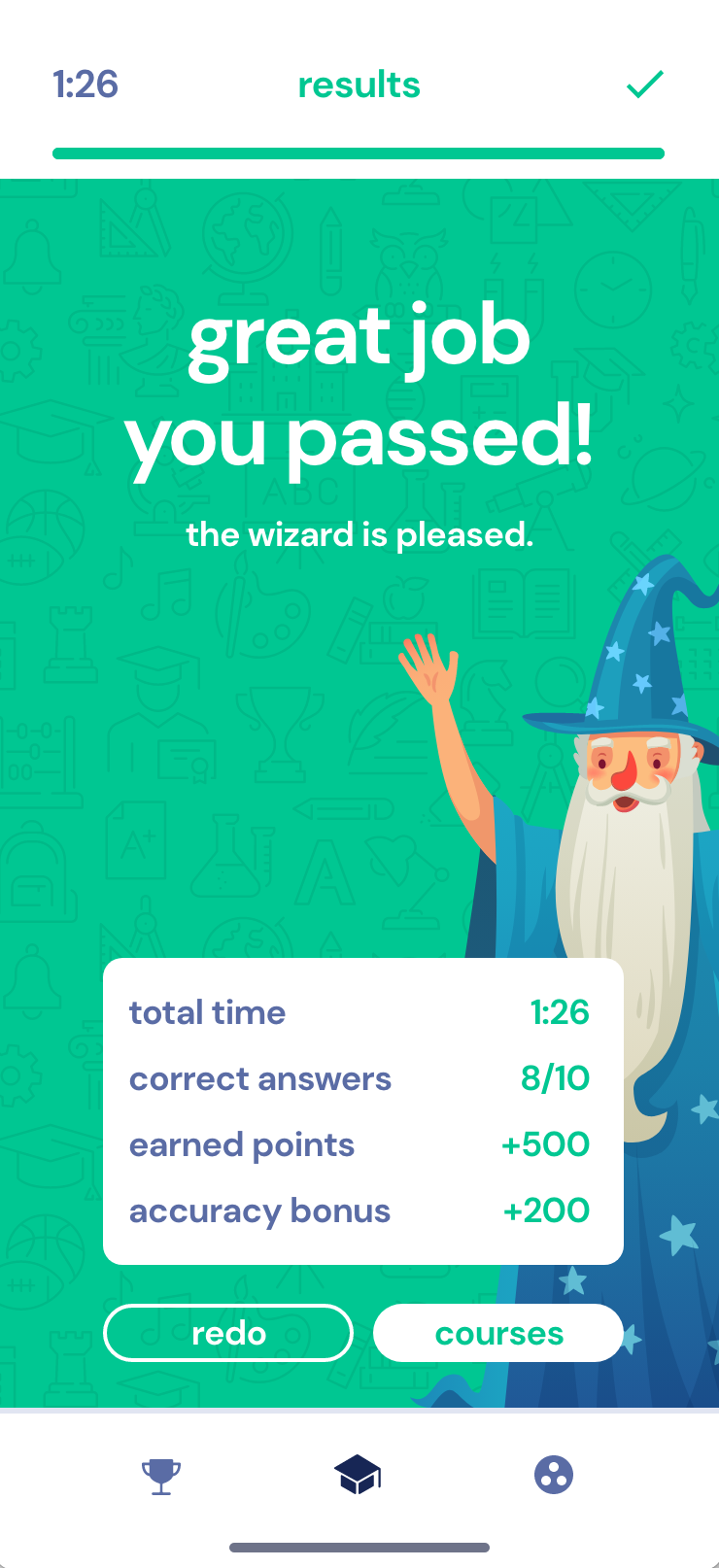
To get students engaged in a new form of learning, we leaned on competitive analysis to understand the modern approach to educational apps. Looking specifically at Duolingo, a leader in language-based educational content, we saw that gamification did wonders for helping students stay engaged and interested in esoteric concepts. We realized that students, especially in their teenage years, resonate better with learning methods that are competitive.
Lesson Learned
A comprehensive understanding of project scope is crucial, and it's essential to pull in additional resources when facing significant challenges. In this case, we became inundated with the sheer amount of content and disparate question types to be included in the app.
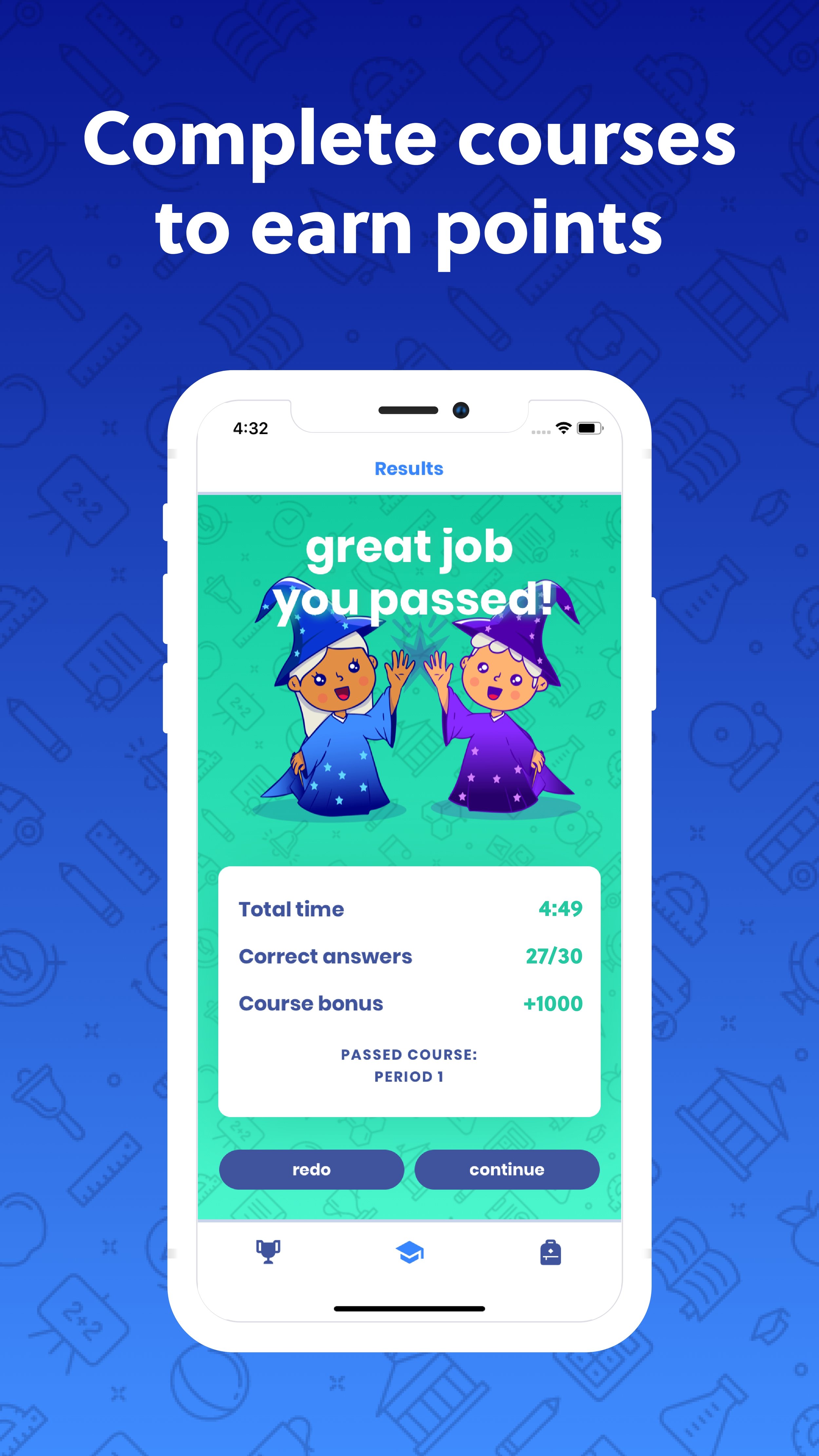
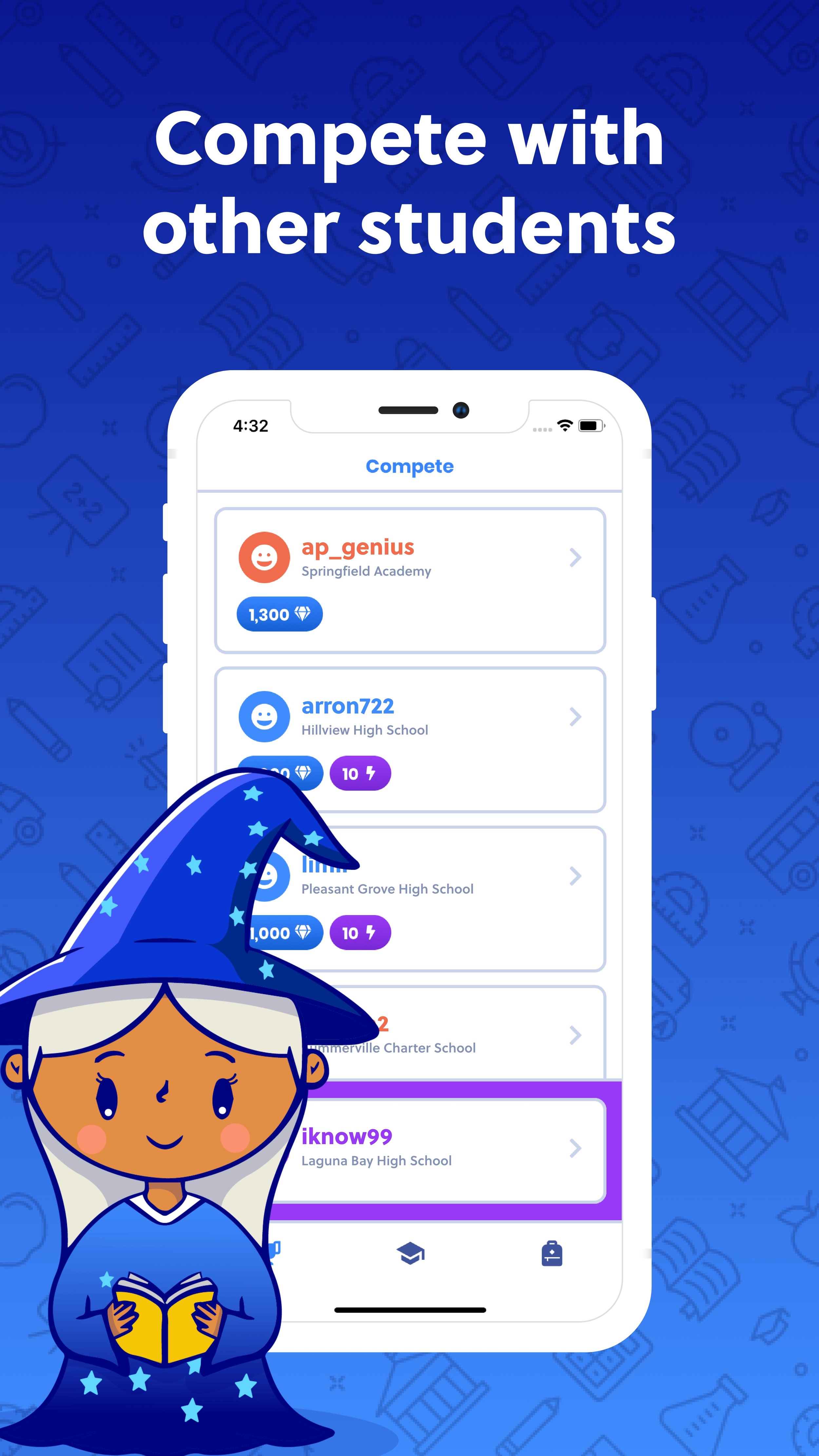
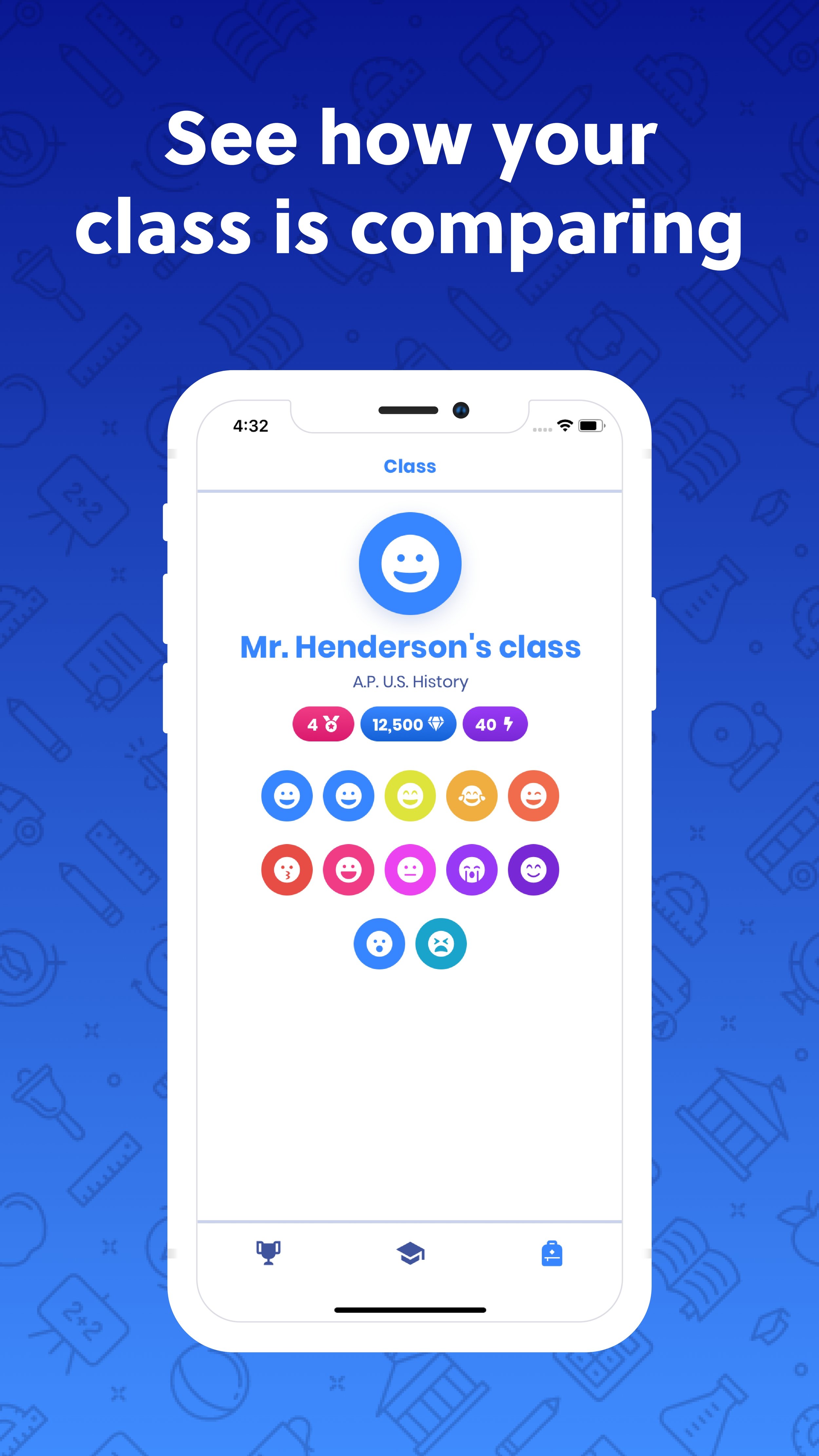
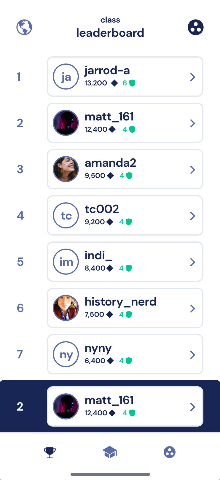
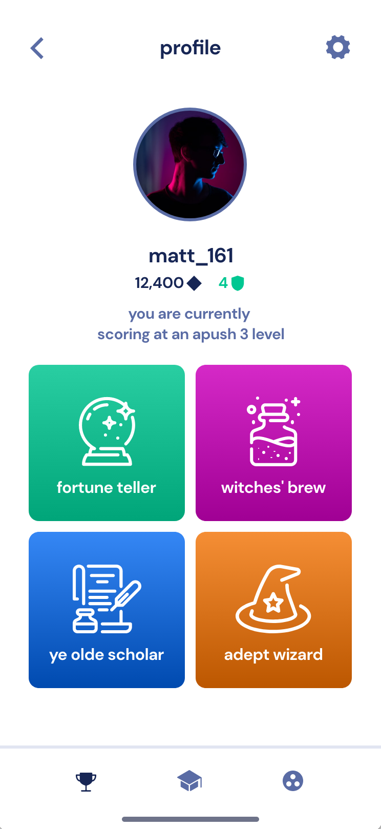
To foster a sense of camaraderie and friendly competition, we introduced leaderboards that allowed students to gauge their preparation against a broader audience and their classmates. Students could earn points from answering questions correctly and see how they rank against other classmates. In our feature development product roadmap, we also considered how achievement badges would drive retention. These badges were markers of students' progress, keeping them motivated and engaged.
How to Monetize an App
Research and Innovation
I was able to conduct a form of competitve research analysis to help determine a viable path forward for monetization, and help bridge the gap between design and strategy.
Finding the right balance between offering value and generating revenue was a key consideration. The team deliberated over various monetization models, weighing the pros and cons of each. We assessed the implications of app store fees on our revenue streams and conducted surveys to understand what users might be willing to pay for.
After evaluations, we chose a monetization strategy that offered the core features for free, with more advanced functionalities unlockable through a one-time purchase. AP exams are typically paid for by the student or the parent; we considered what a nominal price to pay for a study-companion app would be relative to the cost of the exam and thought a one-time fee of $4.99, via an in-app purchase, would suffice. This approach aimed to give users a taste of the app's potential while incentivizing them to invest in the full experience.
Designing the Lesson Experience
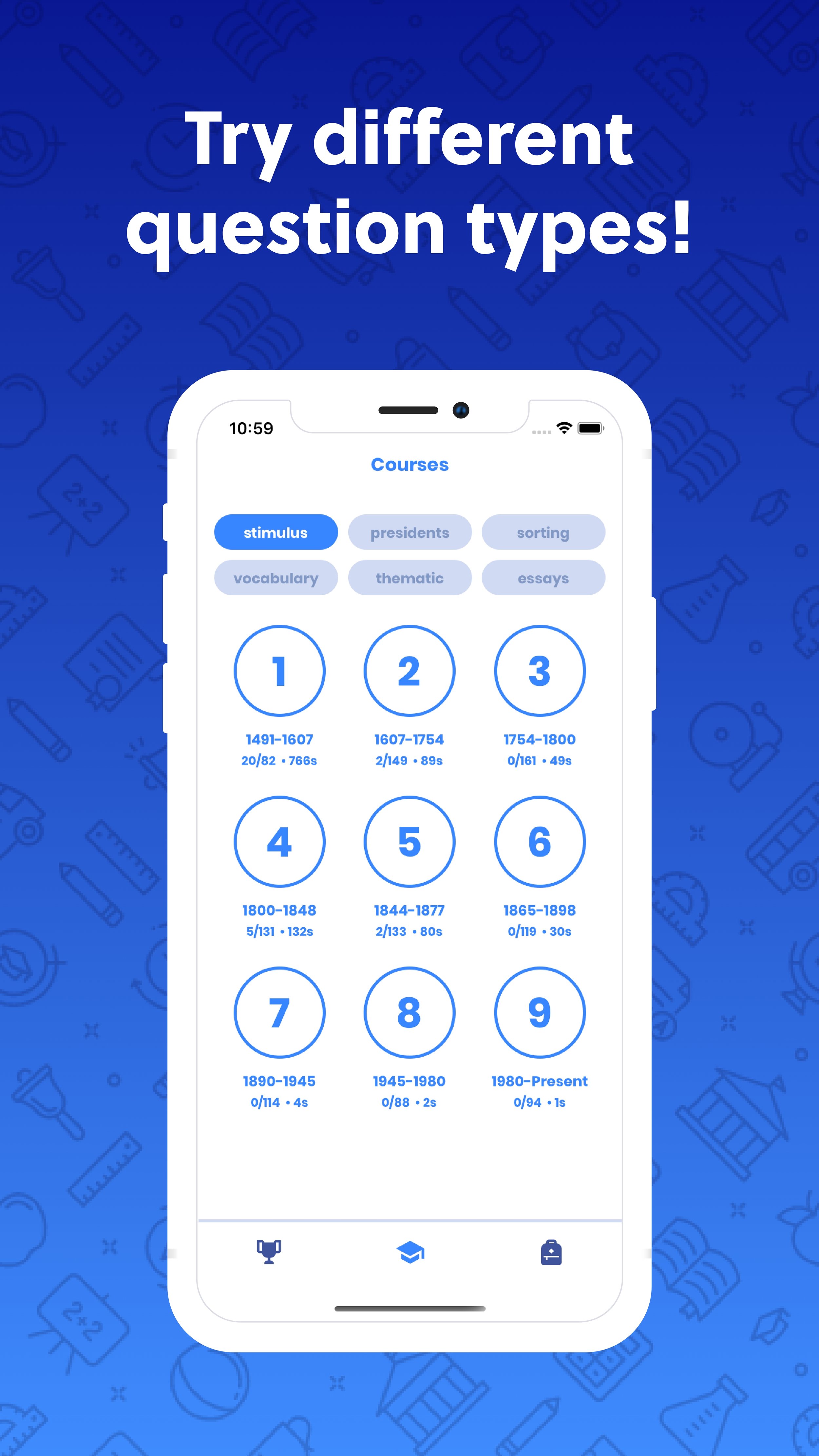
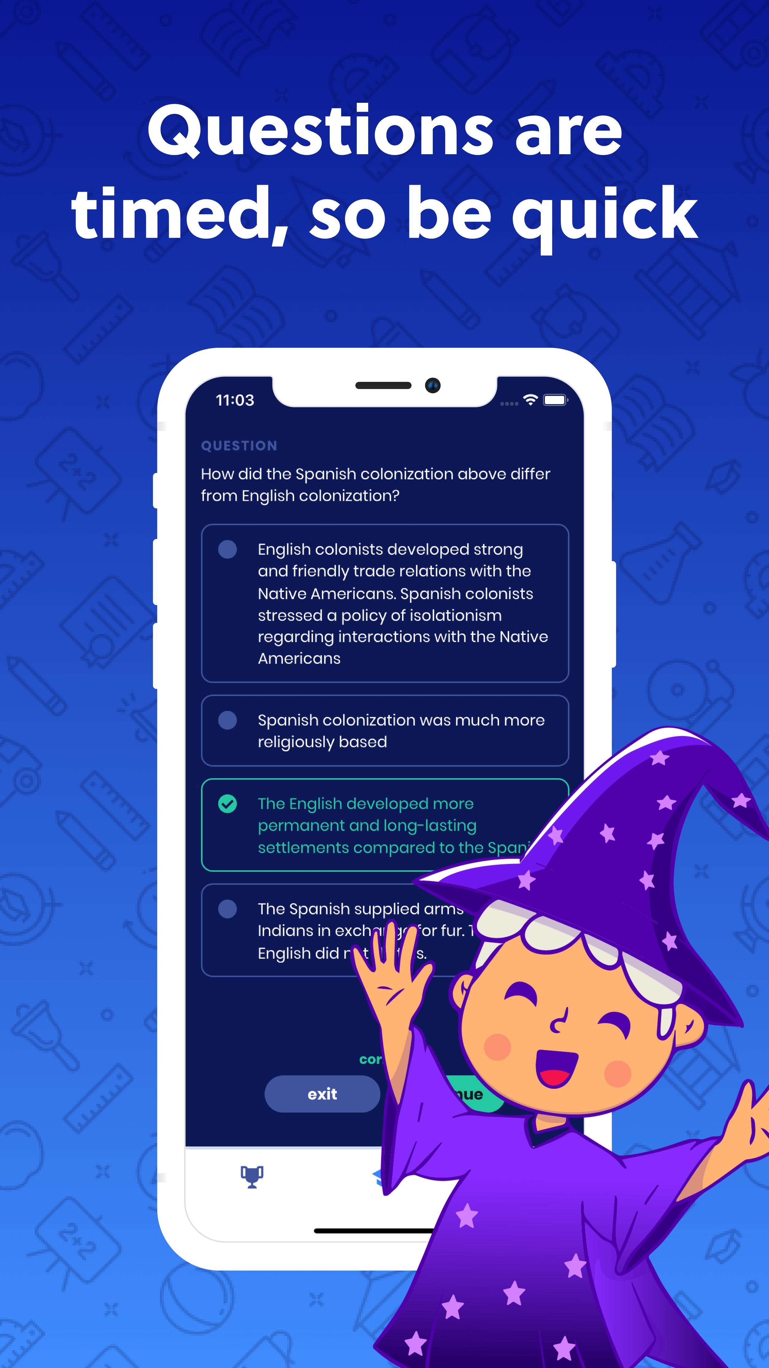
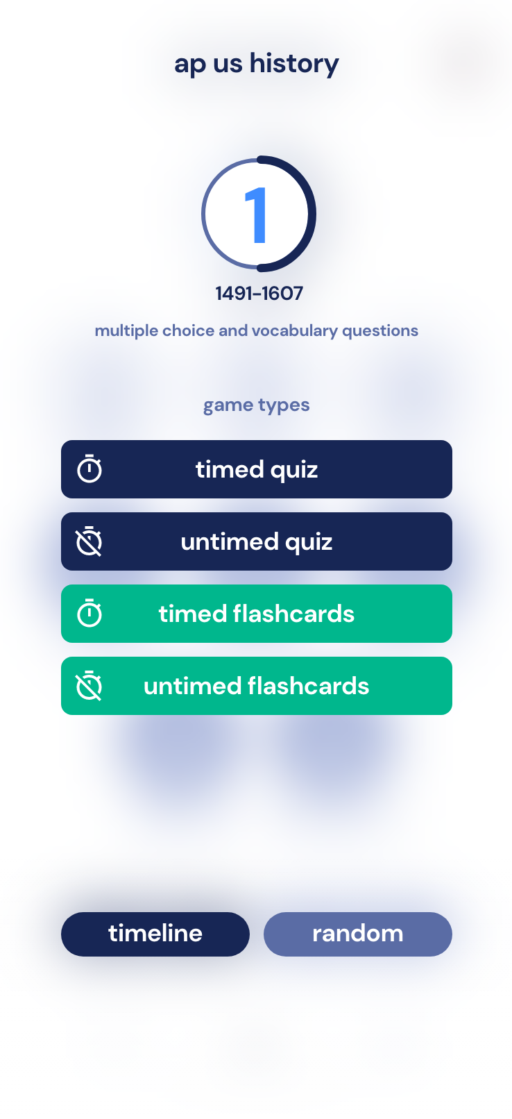
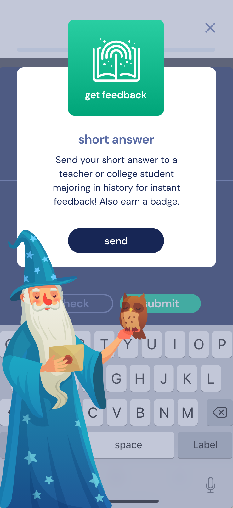
Designing the app began with requirements gathering from the client, which included various question types as requested by the client and his students:
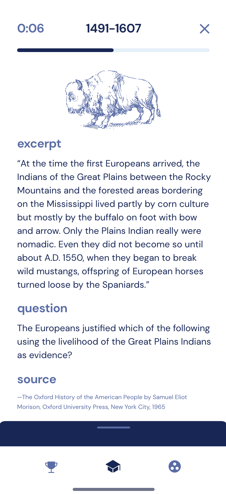
Stimulus-based multiple choice
Vocabulary
Matching
Thematic review
Chronological order tasks
Short-answer questions and sample responses
Long-essay questions and sample responses
Document-based questions with examples and sample essays
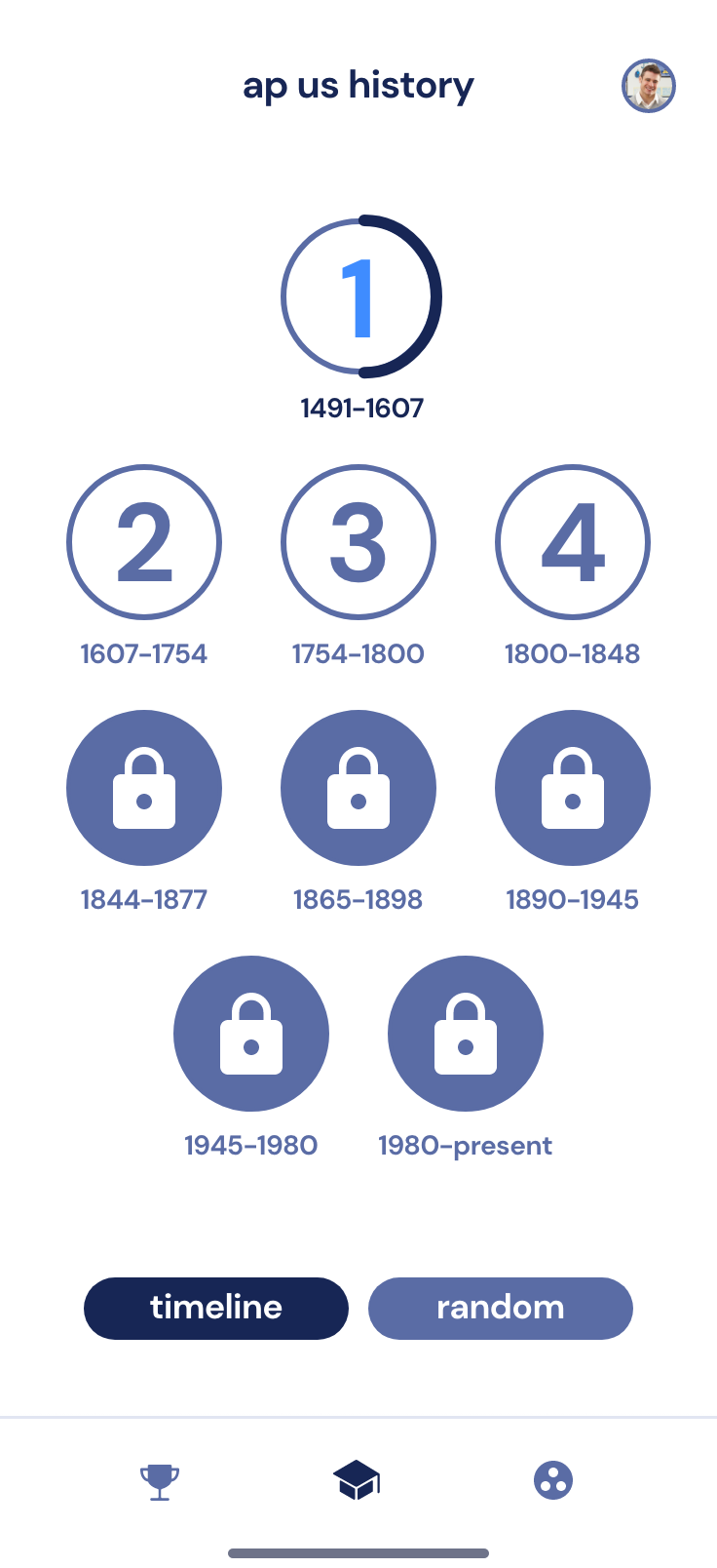
As the project's product designer, I began by mapping out the user's journey and then translating these flows and question types into design elements via extensible components. Starting with sketches and low-fidelity wireframes, I progressed to crafting detailed, high-fidelity interactive prototypes to provide a visual sense of what the app could be. A noteworthy design element was the 'app drawer' mechanism, tailored for mobile devices, which provided users with an intuitive way to navigate content on a small screen during the testing aspect of the app.
Strategic Design Leadership
I worked with the team to help define the role of design in context; I took the question types and turned their workflows into prototypes to test and develop against.
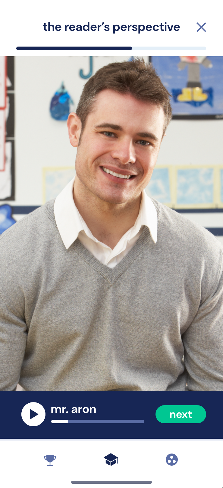
Branding elements, like the logo, consumer-facing website, and social media graphics, were created to resonate with our target audience: tech-savvy high schoolers. A crucial part of the design phase was feedback; with the teacher's aid, we obtained helpful input from students, allowing for iterative refinements. We utilized testing environments for star pupils to provide their feedback directly to their teacher.
Full-Stack Mobile Development
Cross-functional Initiatives
A unique quality I have is understanding what developers have to go through to turn the design into functional components, having worked with front-ends and API middleware. I can help bridge the gap to deliver a better experience.
Transitioning from design to development demanded seamless collaboration between myself and the software engineers on the team. I created the components of the design system and provided notes regarding how they should be implemented. Handing off design specifications means being involved with the engineers as they craft the front end and construct the back end.
I remained hands-on, ensuring that the visual and functional aspects of the app adhered strictly to our predefined standards. Being well-versed in front-end and familiar with API layers and back-end development; I was able to facilitate a smooth handoff, even going as far as styling components in React Native. Open channels of communication were maintained, ensuring that any challenges or uncertainties the development team encountered were addressed.
Launching on App Stores
After the design, development, and testing phases were completed, the final product was ready for its debut. The client was finally able to tell his students to download the app from the corresponding stores and see the potential of this tool in revolutionizing APUSH exam preparation. Our efforts transformed the task of AP exam preparation into a structured, gamified, and engaging experience. The project showed the potential of digital solutions in modern education, setting a precedent for future endeavors in this space.
Outcomes and Results
We successfully delivered an MVP SaaS app across iOS and Android platforms, bringing the client's vision to fruition. This led to valuable downloads for gathering feedback and analytics, thoughts on improvements for user engagement, and a refined strategy for microtransactions.
Disclaimer: Work shown was created while employed at Nearby Creative and displayed with permission. AP and Advanced Placement are registered trademarks of the College Board which is not affiliated with Proven Form, nor does it endorse this app. Header image from Unsplash.


